Global Clinical Trial Supply Chain Platform
Making supply chain risks visible early enough to act
Role
Senior UX Designer
When
Dec 2025 - Present
Team
8 product designers
Business team
Development team
Clinical supply chain SMEs & product owners
Impact
Cut hours of cross-system investigation for users down to seconds by surfacing supply risks in one place
Led the initial 0→1 design direction, establishing patterns across the first screens that guided designers who joined later
Accelerated validation from 4 weeks to 1 by replacing static screens with AI prototypes
All project details and designs have been adapted for confidentiality.
When everything is visible, what comes first?
A global pharmaceutical company runs hundreds of clinical trials each year, with patients testing new drugs and medication. Running beneath it all is the supply chain — the planning of orders, shipments, quality checks, packages, and labels that gets medication to every patient at the right place and time.
Here's the problem: that data is critical and scattered across several systems and teams. By the time a risk becomes unavoidable, a supply chain manager is stuck firefighting instead of getting ahead of it. Our project set out to unify that data into a single visibility platform.
The Key Challenge: In a surplus of detail, how do we decide what to make most visible?
My role: I was part of a design consultant team of 8, working alongside a larger cross-functional program. I translated business requirements into interactive prototypes, cutting through complexity to define what each feature really needed to achieve.
Designing the shortest path to a decision
When it comes to internal tools, there is almost always more information that could be shown than there is space to show it. The question we kept coming back to was: what exactly does the user need to know to make a decision, and how can we get them there as quickly as possible?
We started with business requirements from the client, and faced a common issue: they often described existing workflows and data rather than the decisions users ultimately needed to make.
Take the 'Inventory' feature. The ask was to display previous and current demand forecasts because that seemed to mirror an existing workflow. Planners would spot a demand change first, then switch systems to compare it against the supply, and finally decide whether any action was needed.

Early concept based on the original requirement of comparing demand forecast changes.
These first prototypes were hypotheses we could put in front of users quickly. In working sessions, we collected immediate feedback and continued to probe: What decision do you really need to make? What action needs to follow? What is the true endpoint of the workflow?
That process led us to uncover the actual question the feature needed to answer: When will the earliest shortage happen? That is the signal planners need to investigate the shortage and decide whether the supply plan needs to change.

Final design - the solution shifted from comparing forecasts to identifying where supply would first fall short of demand
That gave the design a much clearer hierarchy. Demand and supply needed to be seen together across a time axis, with the gaps highlighting where are the shortages, surpluses, and most importantly, the earliest point where supply falls short.
In an information-dense product like this, designing the shortest path to decision became a principle we kept returning to across the platform.
Conceptualising a hierarchy of attention
In the 'Inventory' feature, the chart did much of the work of highlighting what needed attention. Meanwhile, most other features relied on dense tables. Across rows of data, the challenge was still designing the shortest path to decision.

An early design for 'Packaging'. All the information for orders was finally in one place, but nothing stood out as requiring action.
We approached this by designing a hierarchy of attention.
At the highest level, summary metric cards quickly showed the overall health of the packaging queue. The most important question they answered was: How many orders were late? When the supply chain manager clicked on them, they would also function as a filter and sort out to the relevant subset of data.
Metric cards surface the late orders at a glance, while also acting as filters
Within the data table, colored circle badges give every order an immediate visual priority too. At one glance, planners are able to distinguish orders that require the most attention.
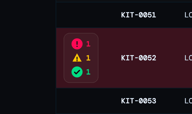
Badges within rows that require more attention
Finally, hovering over a badge answers the next most important question: "Why is this order at risk?" The underlying issue was easily accessible.

Alert reasons are listed within tooltips upon hover
No matter what part of the supply chain you're looking at, each layer of the tool gives you a different level of detail:
Metric cards: What is the most urgent issue?
Badges: Which items are affected?
Tooltip: Why is each item affected?
This hierarchy of attention became a consistent design approach of surfacing risk across the entire platform.
Preparing for launch
Later this year, the first release will roll out to more than 500 employees across the company’s clinical supply organization. By helping teams spot risks earlier and make faster decisions, the platform aims to keep clinical supplies moving to patients with fewer disruptions.