
Climate Action Data Trust
Building a 0→1 carbon platform by uncovering how analysts actually use data
Role
Lead UX Designer
When
8 months, 2023 - 2024
Team
2 UX Designers, 5 Engineers, Scrum Master (PALO IT)
Comms Lead/acting PM, Tech Lead, Brand Designer (CAD Trust)
Impact
Build a “Spotify” for carbon data
Carbon markets are basically the world's climate marketplace. Companies offset their emissions by buying credits from projects, issued by official registries (who verify and record these projects).
As the first platform to unify data across these registries, Climate Action Data Trust had solved a technical problem: their APIs could pull carbon credit data from 11 major registries into one unified system. Databases which previously had never talked to each other could now feed into a single platform. The brief: bring Spotify's search simplicity to this carbon data.
I led design alongside another designer, collaborating daily with CAD Trust's PO and tech lead.
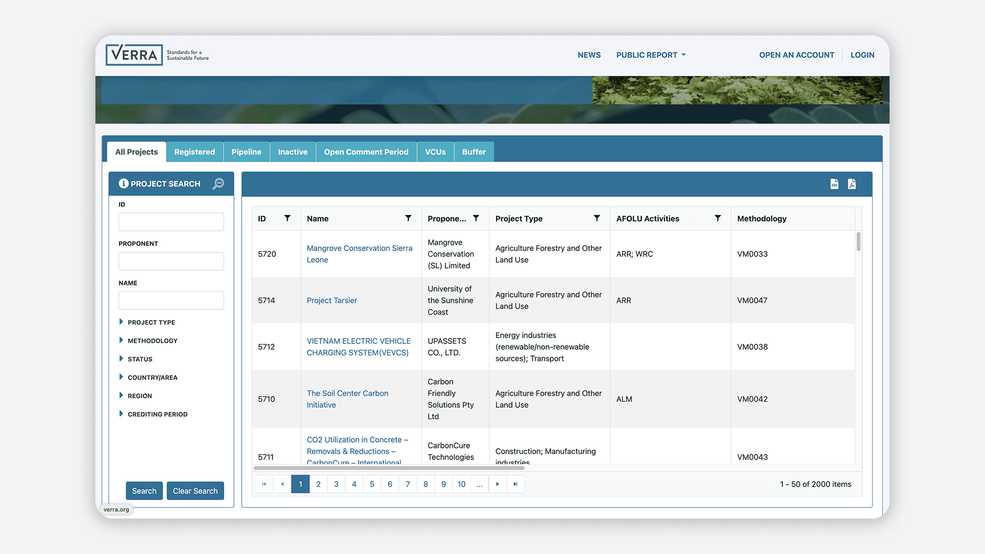
A typical carbon registry interface (VERRA), structured around individual project search
Understanding the system and the users
My approach to complex, technical domains starts with building structural understanding before even touching any design.
First, I simplified the jargon. Working closely with the PO and tech lead, we mapped unfamiliar terms like vintages, issuances, and retirements into entity-relationship diagrams, connecting each concept until the system's logic became clear. This evolved into a comprehensive taxonomy that became our shared reference for many discussions.
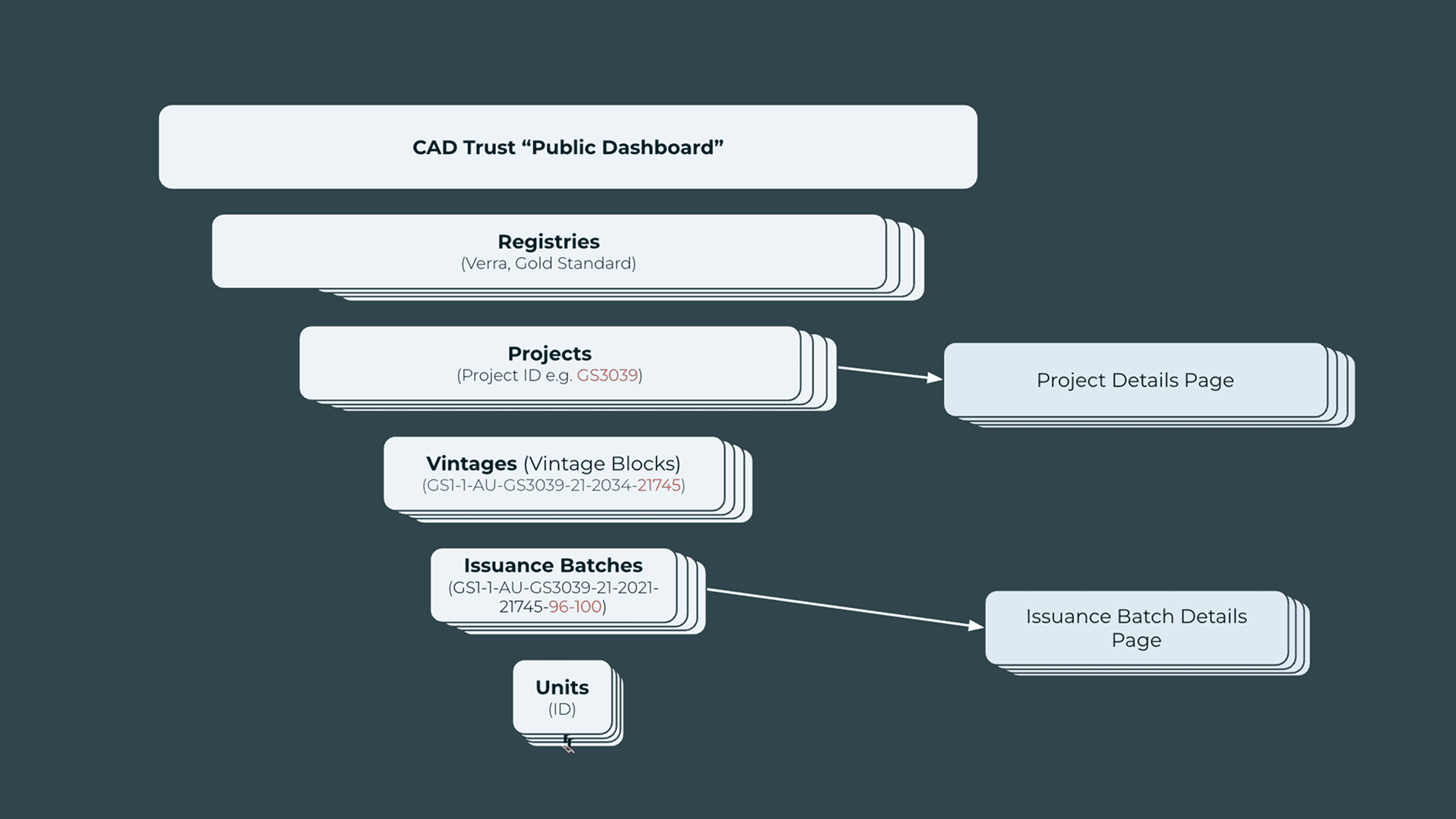
How carbon credits flow through the system: projects generate credits in yearly vintages, then issue them in batches
But breaking down the technical system was only half the equation. The brief focused on redesigning data tables and standardizing interfaces across registries. To do that well, I needed to understand how people actually worked with this data.
I interviewed 16 stakeholders across the carbon ecosystem—traders, registry managers, policy advisors, and journalists.
The breakthrough insight: Users needed patterns, not search results
The assumption baked into every registry's interface was that users would search for individual projects. This turned out to be wrong. 90% of users needed to see the big picture first. An analyst wouldn't search for "windfarm project in Maharashtra"—they'd ask "How many renewable energy projects are in India? Which sectors are most active?"
We realized that simply improving search wouldn't solve the problem. Since we already had the data, we could offer something no other registry provided: visual insights from aggregated data.

Early layout explorations for the homepage
Designing for how analysts actually work
To ensure an insight-first experience, we positioned the visual insights as a dashboard on the homepage. The default landing provides an instant visual overview, while the search functionality remains accessible at the top for users who want to drill into more granular data.

The user flow: landing on the homepage dashboard, filtering by criteria, then accessing detailed search results
On the homepage, the world map takes center stage, presenting aggregated market data at a glance, such as active project counts by region, sector breakdowns, and registry distribution. Analysts can immediately assess regional markets—seeing, for instance, India's active project count and sector composition—without executing a search.
Notably, aggregations like total CO2 reductions, which would normally require manually compiling data across hundreds of individual project listings, appear instantly.
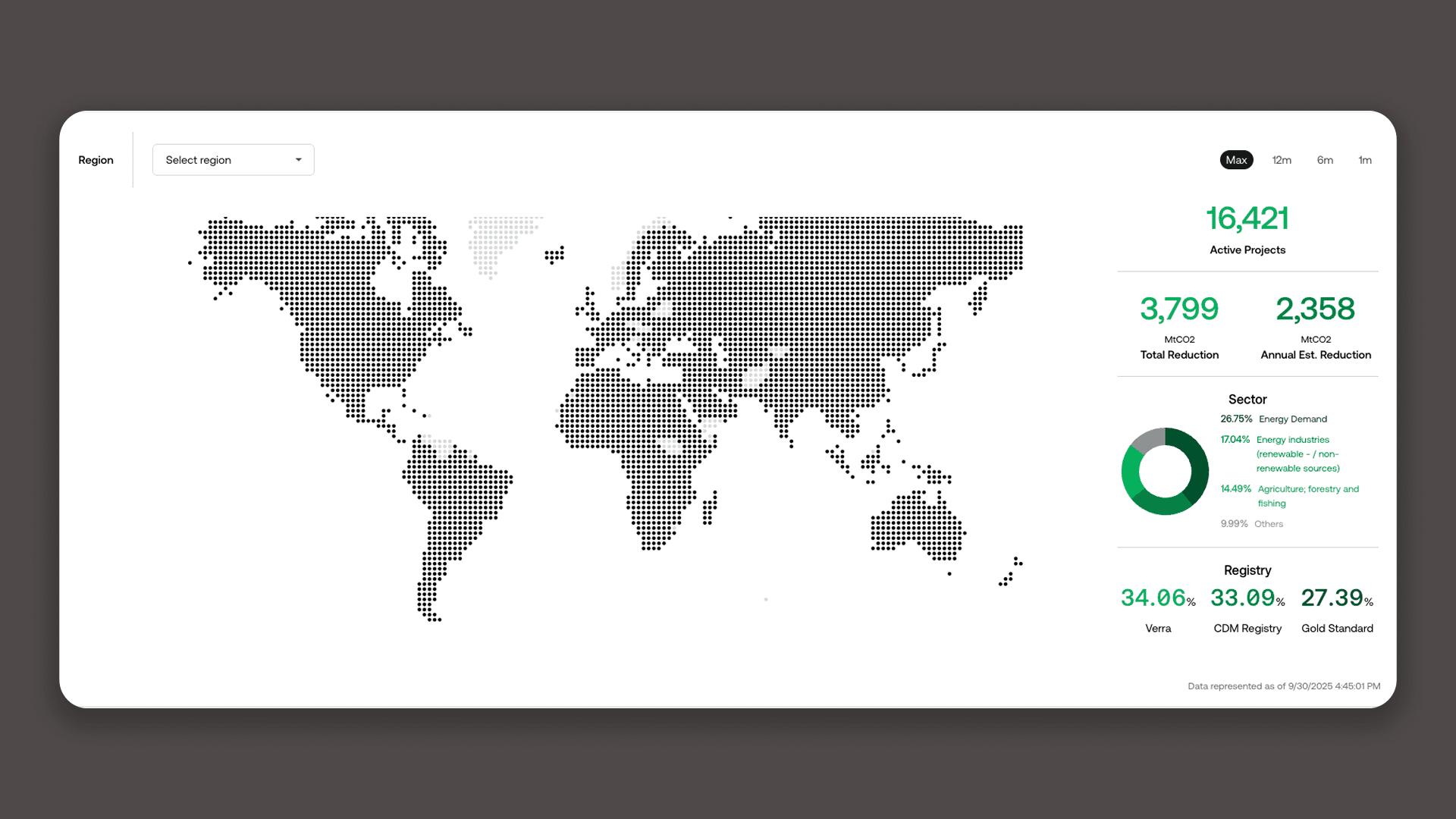
World map widget: Geographic distribution paired with aggregated metrics that previously required manual compilation across hundreds of listings
Beneath the map, a timeline graph shows credit issuance versus retirement over time. Multiple analysts had mentioned wanting to understand market maturity and activity cycles—this graph answers that immediately.
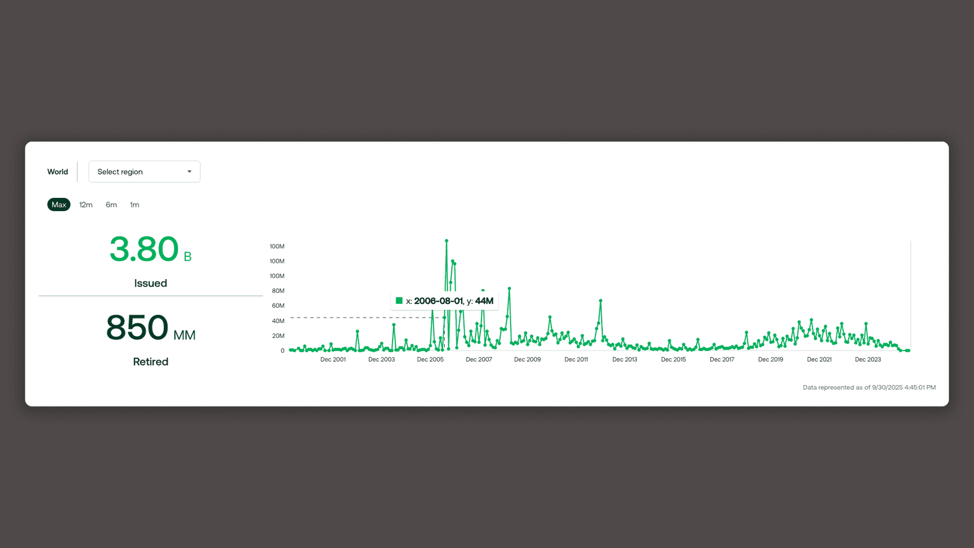
The second dashboard widget: credit issuance and retirement over time, filterable by region
The reported result of these changes was significant: tasks that previously took 30-60 minutes of manual aggregation now take under 5 minutes.
Impact and further enhancements
Our prototype secured seed funding from the World Bank, which allowed CAD Trust to engage our full development team—5 engineers and a delivery lead.
Over the next 5 months, I continued designing features from our backlog while collaborating with engineers to build and launch the platform, which is now used by carbon analysts and traders across 30+ countries.
The platform's impact gained international recognition, being showcased at the World Economic Forum's GAEA Awards and the World Bank's Innovate4Climate conference.

Dinesh Babu, CAD Trust’s Executive Director, introducing the platform at UNFCCC Climate Change Conference 2023
The foundation we designed continues to generate new capabilities. From scalable search filters to adaptable data visualizations, the platform is evolving in step with user feedback and the expansion of global carbon markets.

A post-launch enhancement: expanding the filtering system allowing users to refine searches across 8 additional criteria
Client Testimonial
"Inez's remarkable blend of technical skill, creativity, and proactive approach sets her apart in the field of user interface design."
- Luka Biernaki, Communications & Marketing Director, CAD Trust